Created for the Google UX Certificate program
This product is for a local coffee shop that would like to have an online ordering system. Their target users are people who would benefit from the ease and time saved with placing an order online and picking up in store.
Duration: May 2022 - September 2022
Tools: Figma
The problem:
Customers want to be able to see menu options and be able to customize their orders.
The goal:
Build an app where users can choose what goes in their order and see the ingredients.
My role:
UX designer doing research and design for the coffee shop app from conception to delivery.
Responsibilities:
Conducting interviews, paper and digital wireframing, low and high-fidelity prototyping, conducting usability studies, accounting for accessibility, and iterating on designs.
User Research
I conducted interviews with people who have had experiences using mobile apps for a coffee shop. I wanted to understand more about why they use the app and their likes and dislikes about it.
Most have only had experience with the Starbucks app and all have had positive experiences with it like I had assumed. There were some minor issues or suggestions that were mentioned in the interviews and those were used to help to create personas.
Pain Points
Customization - There is lack of customization in some apps so user do not always get the options they wanted.
Information - Sometimes more information for each item can be included because some people have dietary preferences.
IA - The way the menu options are presented should make it easier for the user to make a decision.
Paper Wireframes
From the user pain points I found, I drafted paper wireframes that aimed to include features such as customization and recent and featured drinks. This is one set of five sets of wireframes that I drafted. I added a star next to each element I wanted to include in the refined wireframe.
Digital Wireframes
As I started the initial design phase, I made sure to base screen designs on feedback and findings from user research.
Recents and Seasonal panel was added so users can swipe through and have an easier time deciding on what to order.
One of the findings from my user research was the need for customization of orders. This screen ensures there are options for several needs.
Low-fidelity prototype
This low-fidelity prototype shows the primary user flow of choosing and ordering coffee for pick up.
Usability study: findings
I conducted two rounds of usability studies. The first study analyzed wireframes and helped guide designs for mockups. The second study analyzed a high-fidelity prototype and improved on mockups.
Round 1 findings:
Users found the flow easy to use.
Users want to be able to customize their orders.
Users wanted certain elements added such as accessibility and a back button
Round 2 findings:
The dropdown options for customizations are difficult to click.
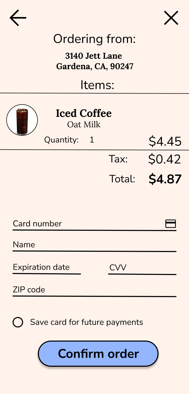
The payment page is an important part of the user flow.
It is not clear how to navigate back to the homepage.
Mockups
After running the usability studies, I found that users wanted the customization options to be more usable for the mockup and that they were concerned about the accessibility of the plus icon for users who not might be able to understand the meaning of it.
Before usability study
After usability study
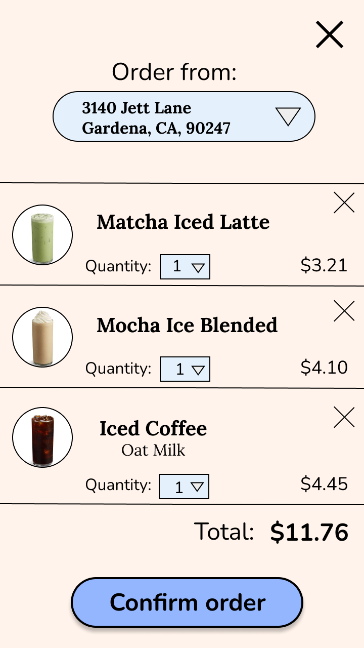
After the second usability study, I learned that users were confused about the extra items in the bag for the prototype and were expecting a payment page that was missing from the flow.
Homepage
Order page
Confirmation page
Homepage (after order)
After
Before
High-fidelity prototype
The final high-fidelity prototype included more usable customization options, cleaner flow and a payment page.
When building my design, I carefully picked out colors that would pass the WCAG contrast ratio.
There were concerns during usability studies that not everyone may understand the + icon so I opted for a caption on the button instead.
After my second usability study, I made the button for milk options more accessible by making it bigger and therefore easier to press.
Accessibility considerations
Takeaways
Impact:
This app provides a clear way to meet users needs.
Quote from usability study:
“I like how the flow is simple and you can expect what comes next.”
What I learned:
I learned how big an impact research has on the design of an app. We really are designing for the users.
Next steps
Conduct more user research to see if the design changes address users needs and if there are other problem area to address for the new design.
Add more function and accessibility features to the app.
Thanks for viewing my case study!


