Andrea’s Animals is a rescue organization for local dogs and cats. Their goal is to find good homes for as many of their rescued animals as possible.
Created for the Google UX Certificate program
Duration: September 2022 - December 2022
Tools: Adobe XD
Adopt a pet page - desktop
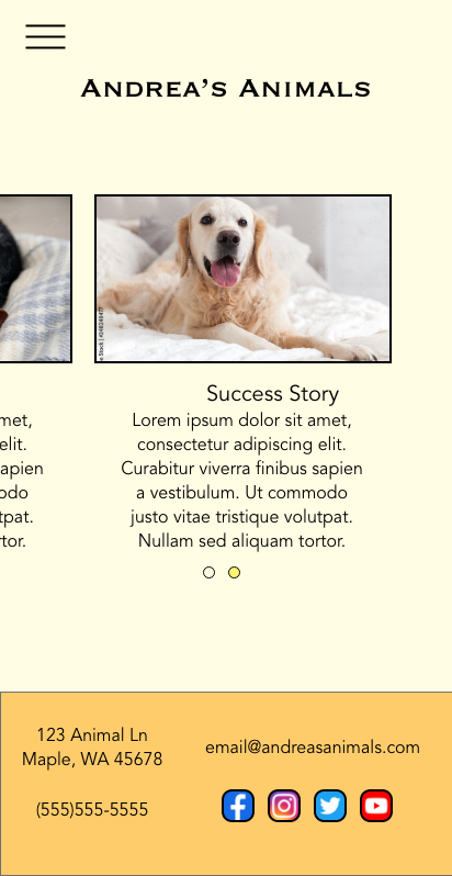
Homepage - mobile
The problem:
There are many pets who need homes and people who are looking for pets to adopt.
The goal:
Find a way for the rescue to connect with potential adopters of pets before going to the location.
My role:
UX designer
Responsibilities:
User research, wireframing, prototyping, iterating on designs and responsive design
User Research
I conducted user interviews to better understand the target user and their needs. I wanted to understand how people would go about looking for a pet to adopt. I discovered that users would want an easy way to view potential pets before going to visit the shelter and learn about their attributes as well.
Pain Points
Visuals: Users want to view pets, especially pictures, before visiting
Information: Potential adopters want information about the pets at the shelter
Sitemap
I created a sitemap to lay out the information architecture and to determine the navigation.
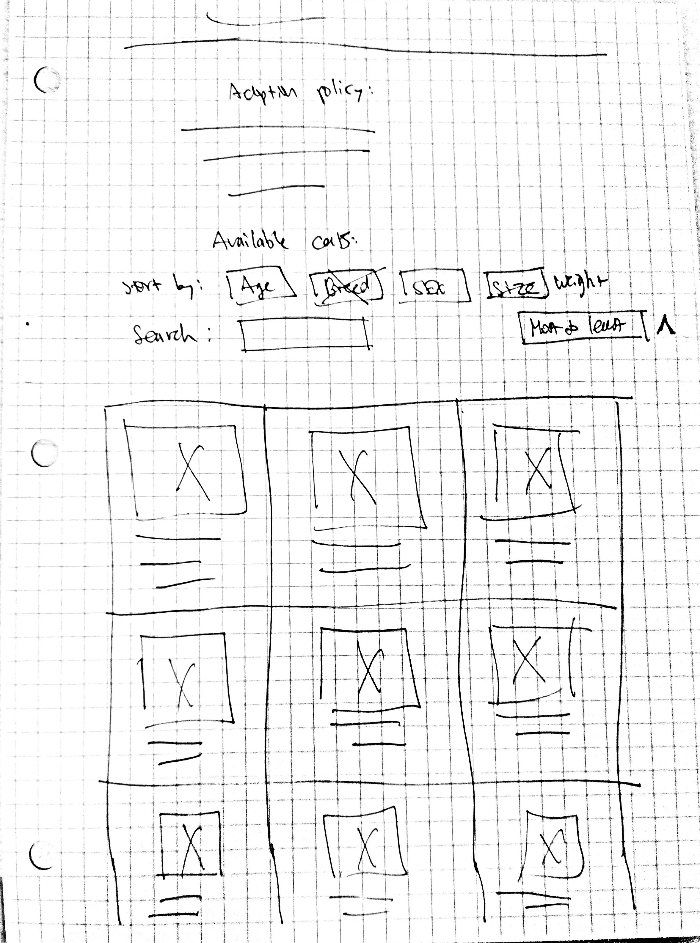
Paper Wireframes
I sketched several ideas for the homepage and pet page and refined those wireframes to create the paper wireframes on the right.
Adopt a pet page
Homepage
I then sketched a mobile version of the website, making sure the site would be fully responsive.
Digital Wireframes
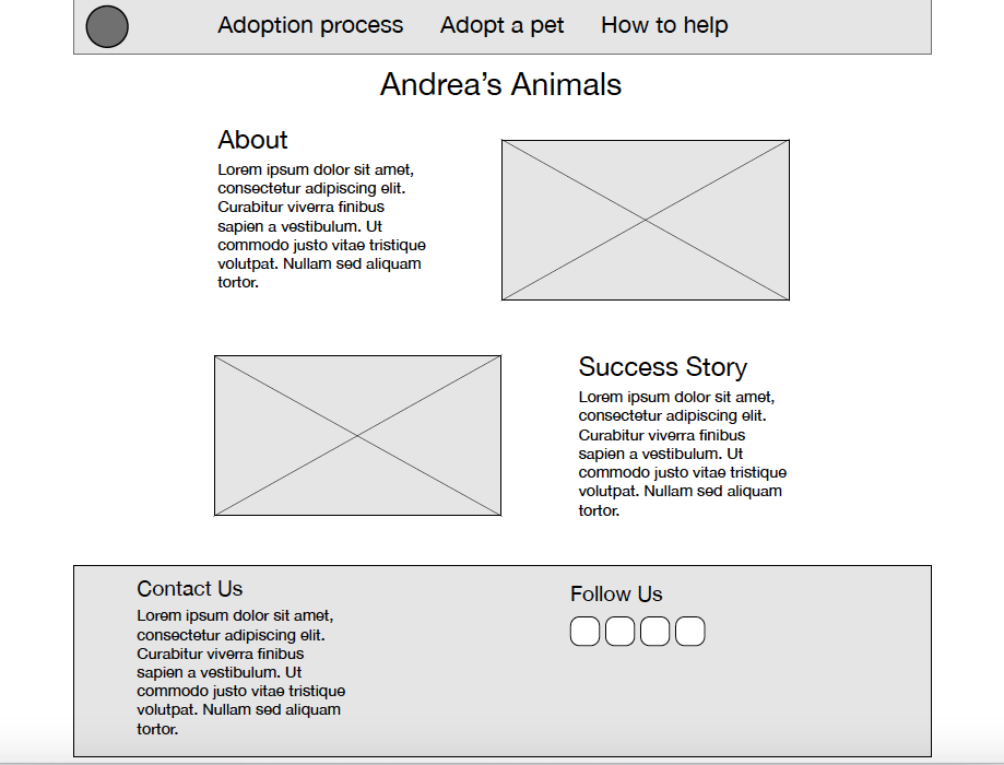
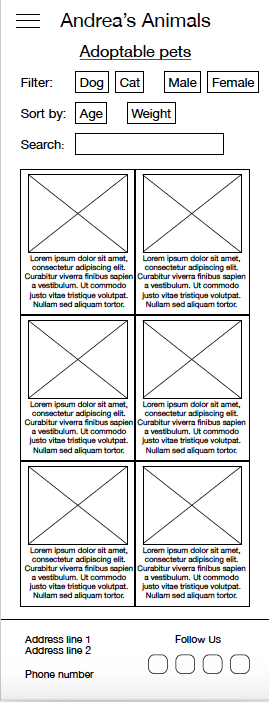
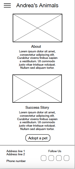
I wanted to include a navigation bar for users to find needed information. I tried to achieve a visually appealing homepage by adding images as well as text. The search page allows users to view multiple pets at a time.
Homepage - Navigation clearly marked. Headers included.
Adopt a pet page - Filters to make it simple to find pets.
Adopt a pet page (mobile)
Homepage (mobile)
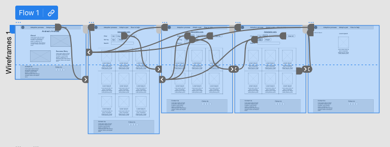
Low-fidelity prototype
I made connections between the screens for the user flow of selecting a pet to view.
Usability Study
moderated usability study
United States, remote
5 participants
20-30 minutes each
Findings:
Search - Users wanted an easier way to be able to search by breed.
Main flow - Users felt like there needed to be more to the flow after the last screen.
Other flows - Users had tried to click on the other links on the website that were not part of the flow.
Mockups
Based on the insights of the usability study, I added more screens to the flow so that users would be able to schedule a meeting with a pet instead of just viewing them on the website.
I changed the ‘search’ option to ‘breed’ so that it would be more obvious that users will be able to search by breed.
Mockups: original screen size
Mockups: screen size variations
I created mockups for a mobile site so users can access it on different devices while having a responsive experience.
High-fidelity prototype
The high-fidelity prototype includes changes made after the usability study.
Accessibility considerations
I used headings and size considerations to establish a clear visual hierarchy.
I considered color combinations that would allow for the best experience for the visually impaired.
Takeaways
Impact:
Users who tested my design as well as peers who reviewed it remarked on the clear design, ease of navigation, and the overall idea of the website.
What I learned:
I learned many things including who to make a design more visually appealing as well as how to make it easier to navigate.
Conduct a follow up usability test on the new website
Identify any areas of need and ideate new features
Next steps
Thanks for viewing my case study!


