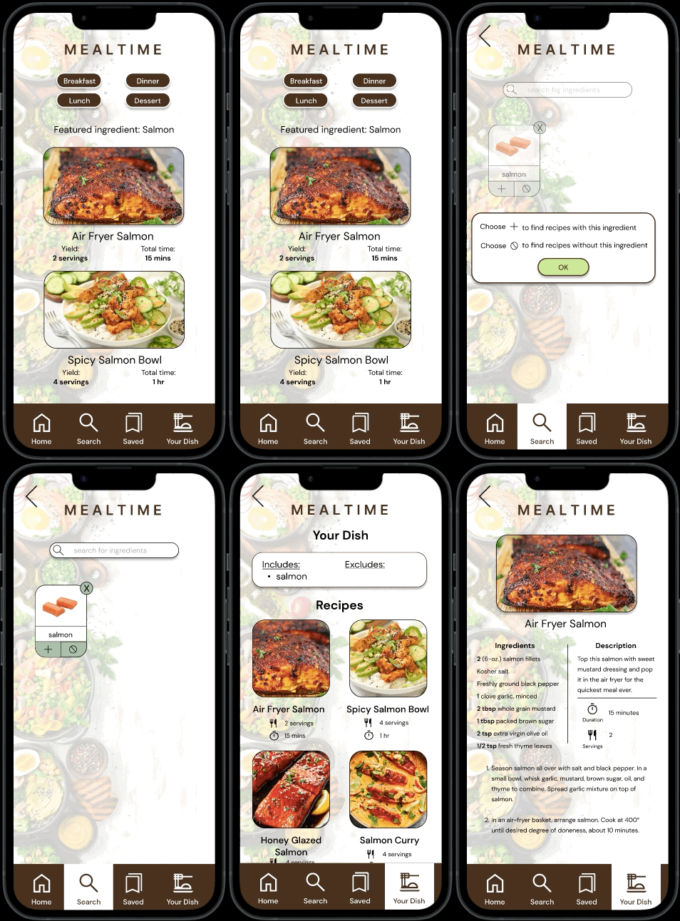
Mealtime is an app concept that aims to help people learn to cook healthier meals.
Duration: July 2023 - September 2023
Tools: Figma
Created for the Google UX Design program
Initially, I gathered information by interviewing people around me about whether or not they cook their meals and how they go about figuring out what to cook.
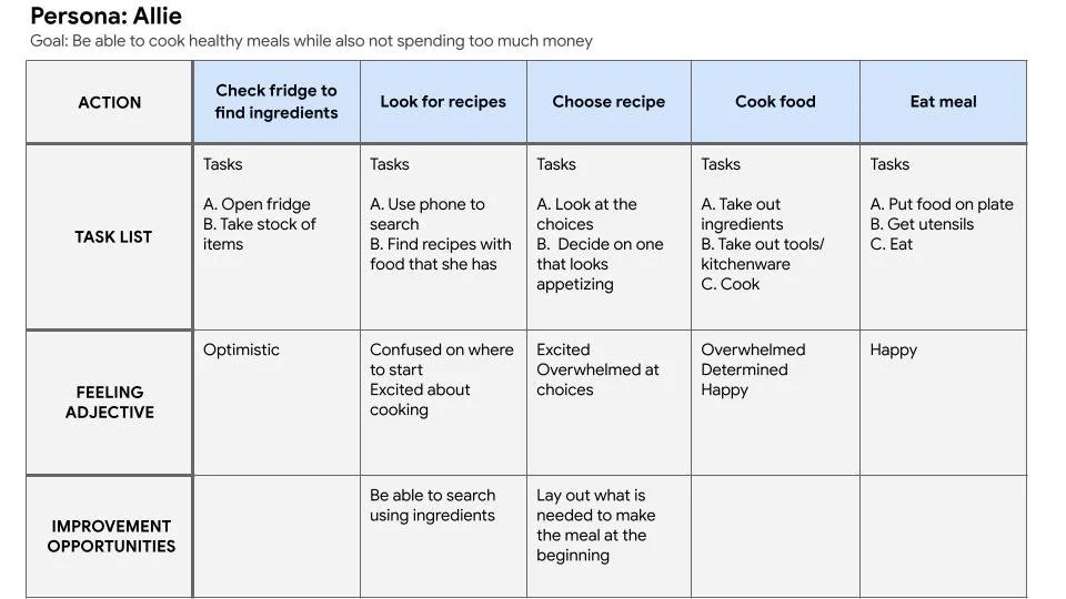
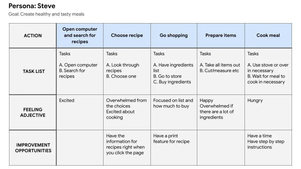
From there, I formulated personas, user stories, and user journeys.
Here are two of the user journeys I created:
In order to ideate solutions for the problem statement, I carried out a competitive analysis of three similar websites to identify their strengths and weakness and gaps in the market that would help drive our design.
I found that out of the three websites, none of them had a way to search for recipes by dietary restrictions such as gluten or other allergies. This would be an opportunity for us to create a site catered to people with allergies or create a feature that would allow people to search according to allergies or diets.
I utilized the How Might We exercise to ideate solutions to user needs.
How might we create a way for people to avoid recipes that include foods that they are allergic to?
Allow users to exclude certain ingredients when searching for recipes
Have settings/preferences that allow for filtering of search results to exclude the foods they want to avoid
How might we teach people about ways to eat healthy and delicious foods while still being mindful of their dietary restrictions?
Have a page that includes tips on how to include certain ingredients in recipes
Have tips right on the recipe page on ingredients they could include or exclude
How might we include recipes for people with certain dietary restrictions such as vegetarian, low fat/sugar, low sodium?
Have a page of featured recipes for certain groups
Have tags to search for recipes and/or on the recipes themselves
Next, I used the rapid sketching technique crazy eights to brainstorm designs and features that would address user needs. From those sketches, I created paper wireframes which I then developed into digital wireframes that later became low-fidelity prototypes.
Firstly, I had to create a sitemap in order to know how to organize the pages and features.
Low-fidelity prototype
From here, I organized a usability study in order to find out if the low-fidelity prototype would be a good layout for building the app.
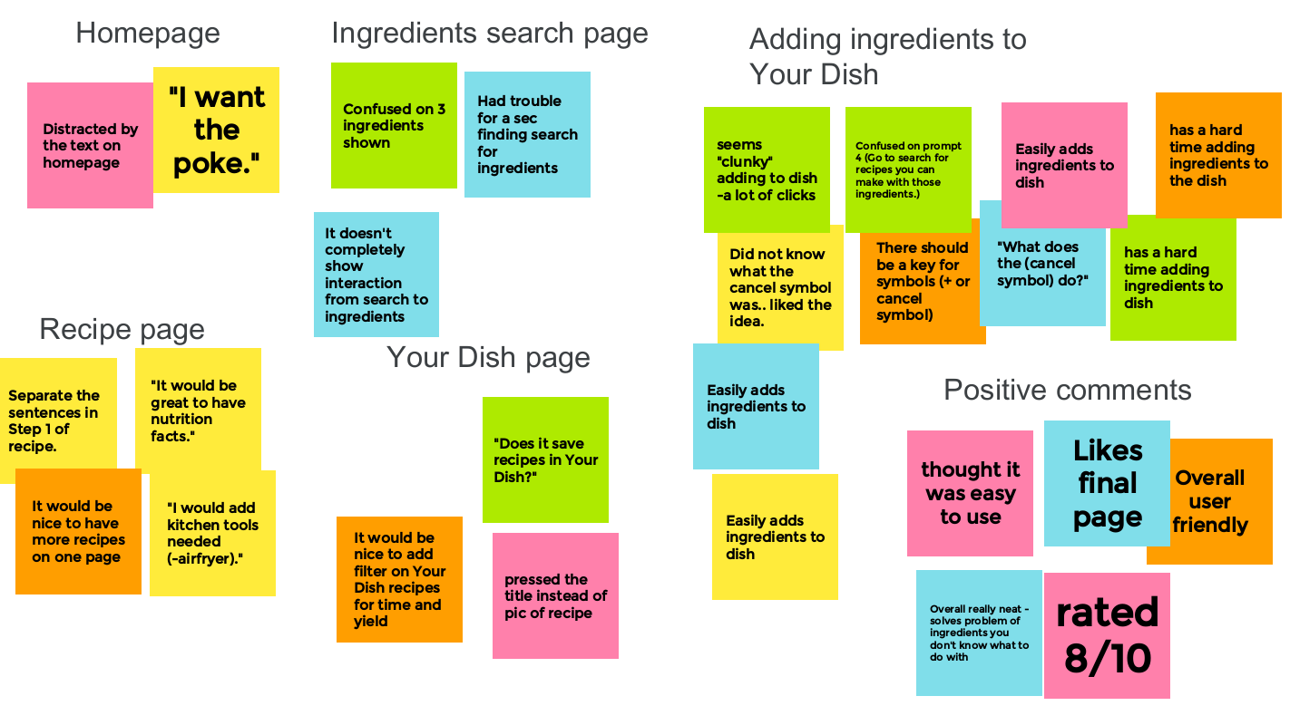
Here are my findings organized into an affinity diagram.
Based on this, I found common themes and patterns that I organized into insights to help guide the next phase of the design process.
My insights were:
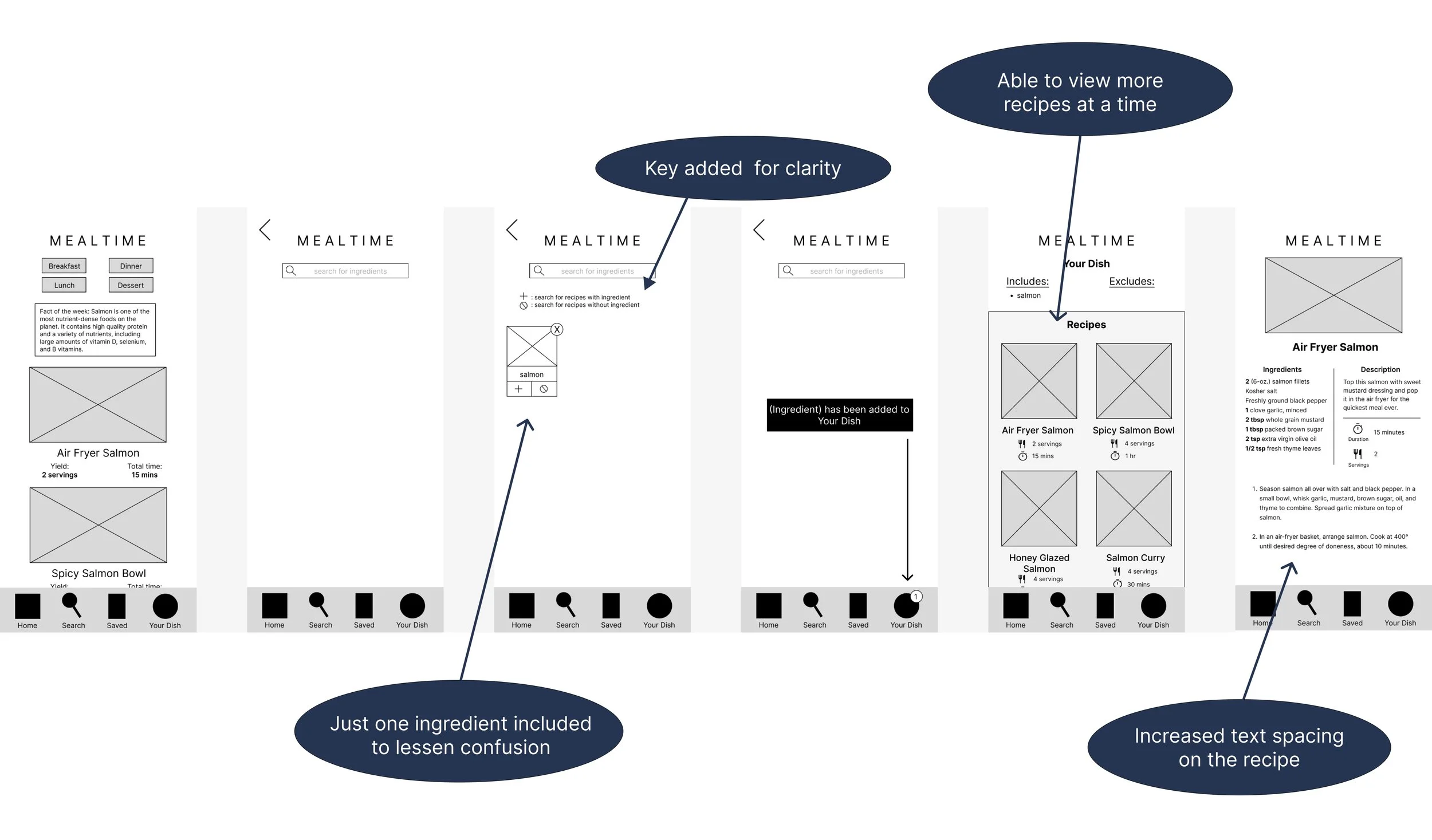
The prototype should be more clear on how to search for ingredients.
There should be a key or tutorial on how to add or subtract ingredients from a dish or a different process should be considered.
The UI for the recipe page should be revised.
Adding features to the Your Dish page should be considered.
I then adjusted the lo-fi prototype with these insights in mind.
High-fidelity prototype
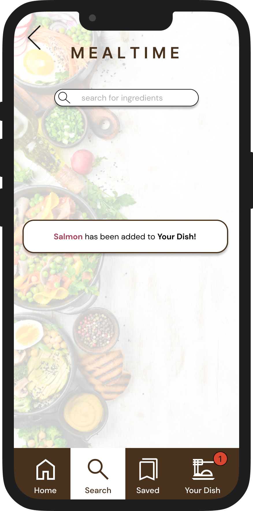
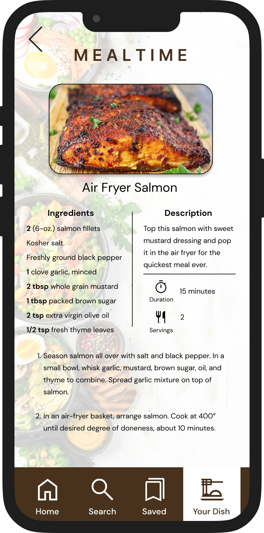
Adding color, icons, typography, and visual design principles, the high-fidelity prototype came to life.
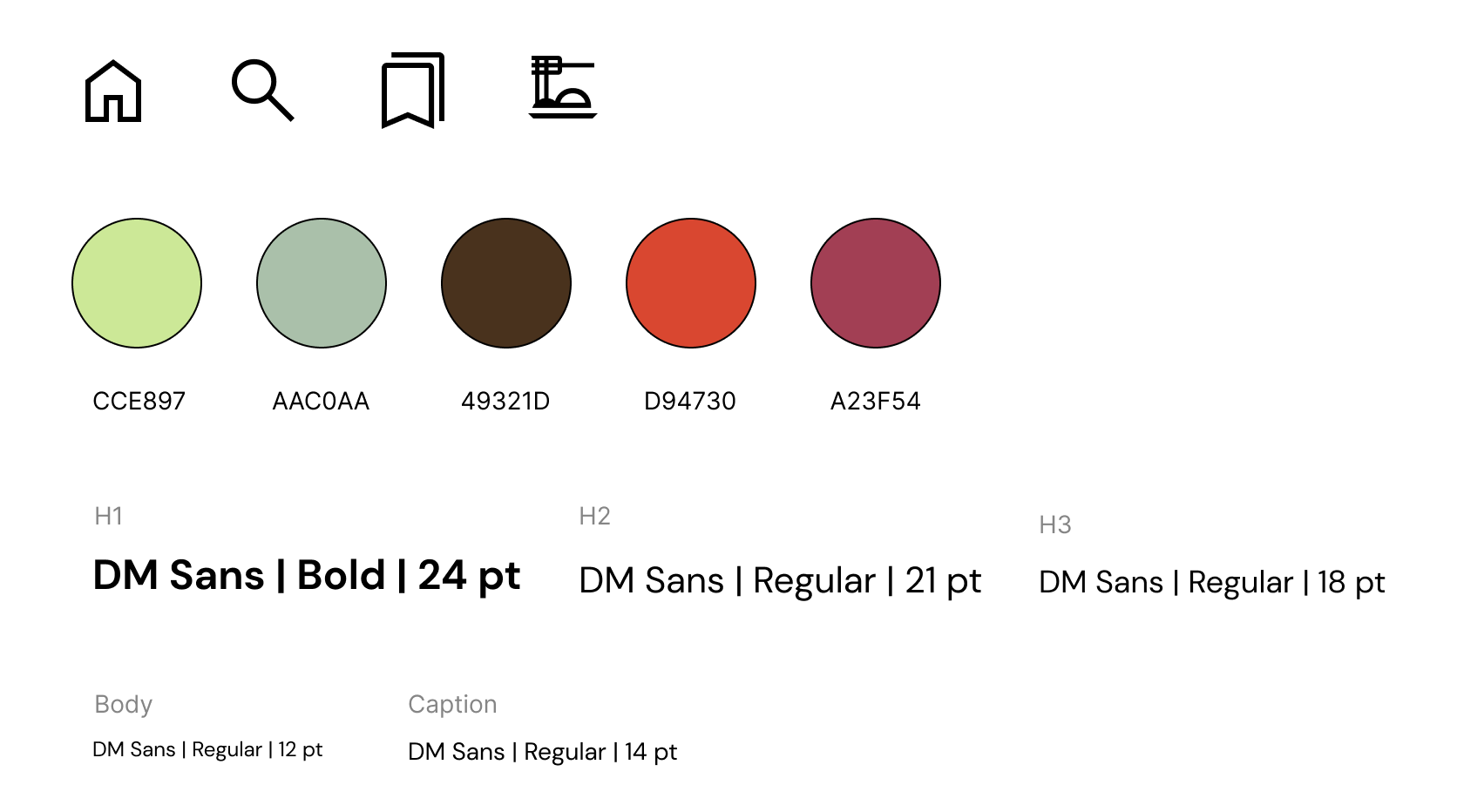
Sticker sheet to keep track of icons, color, and typography.
Interactive prototype - search for a dish!
In addition to the mobile app, I also drafted responsive wireframes for mobile web browser, tablet, and desktop sites.
Mobile web homepage
Tablet web homepage
Desktop homepage
Next steps
Develop high-fidelity prototypes for responsive designs
Run a second usability study for the mobile application to determine effectiveness of design.
Thanks for viewing my case study!
